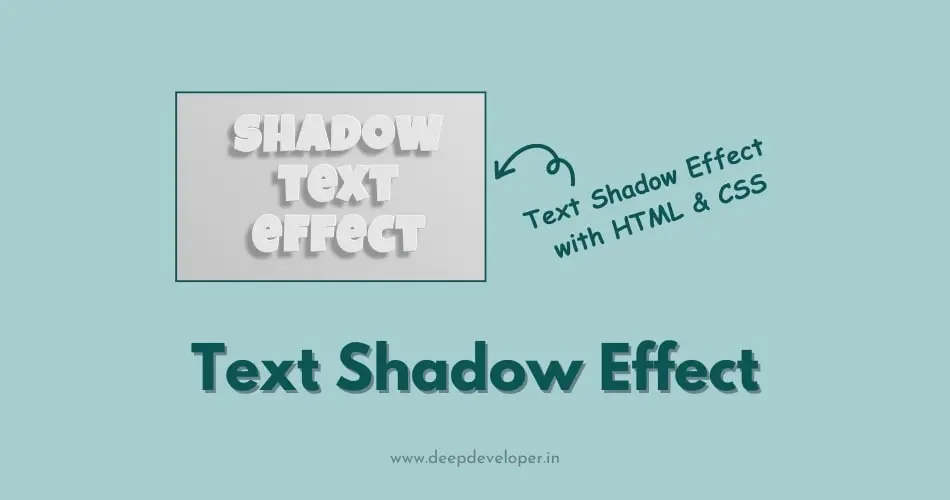
In this blog post we are going to create a special shadow effect on text with the help of CSS. Basically, text shadow effect is used to add depth, dimension, and style to typography of your website design. With the combination of HTML and CSS, you can easily implement various text shadow effects such as basic shadow, inset shadow, multiple shadow, neon shadow etc. Adding shadow to your text make it stand out and enhance the visual appeal of your web pages.
Text Shadow Effect Using HTML & CSS
HTML Structure
Create a html file with name index.html and write shadow text effect text in h1 heading tag.
<!DOCTYPE html>
<html lang="en">
<head>
    <meta charset="UTF-8">
    <meta name="viewport" content="width=device-width, initial-scale=1.0">
    <title>Text Shadow Effect</title>
    <link rel="stylesheet" href="style.css">
</head>
<body>
<h1>shadow<br>text<br>effect</h1>
</body>
</html>
Styling With CSS
now create a CSS file with name style.css and connect this file to your index.html file with the help of <link> tag. Add the below given styling to your heading to implement shadow to your text. Here I am using google font “Luckiest Guy” to create a visually appealing heading.
@import url('https://fonts.googleapis.com/css2?family=Luckiest+Guy&display=swap');

html, body { height: 100%; margin: 0; padding: 0 }
body {
  background-image: linear-gradient(45deg, hsl(0 0% 75%), hsl(0 0% 90%));
  display: grid;
  place-items: center;
}
h1 {
  font-family: 'Luckiest Guy', cursive;
  font-size: 20vmin;
  line-height: 1;
  margin: 0;
  letter-spacing: 0.075ch;
  color: hsl(0 0% 90%);
  text-align: center;
  --light-pos-x: 1; /* left: -1, center: 0, right: 1 */
  --light-pos-y: -1; /* top: -1, center: 0, bottom: 1 */

  --rim-size: .02ch;
  --shadow-offset: .2ch;
  --shadow-blur: .1ch;
  text-shadow:
    calc(max(var(--rim-size), 1px) * var(--light-pos-x)) calc(max(var(--rim-size), 1px) * var(--light-pos-y)) hsl(0 0% 100%),
    calc(max(var(--rim-size), 1px) * var(--light-pos-x) * -1) calc(max(var(--rim-size), 1px) * var(--light-pos-y) * -1) hsl(0 0% 60%),
    calc(var(--shadow-offset) * var(--light-pos-x) * -1) calc(var(--shadow-offset) * var(--light-pos-y) * -1) var(--shadow-blur) hsl(0 0% 50% / .75)
}
Note: This effect consists of two highlights and a shadow, each created using the text-shadow property with specific values for position, color, and blur radius.
Output:

Also Read: How To Horizontally Center A DIV With CSS
Final Words:
In this blog, we’ve created text shadow effects using HTML and CSS. We have used text-shadow property and experiment it with different values. In the same way you can also create visually stunning typography for your website. Text shadow effect is an easy and simple tool to enhance the design and readability of your content. If you find this tutorial helpful, don’t hesitate to share it with your friends.

