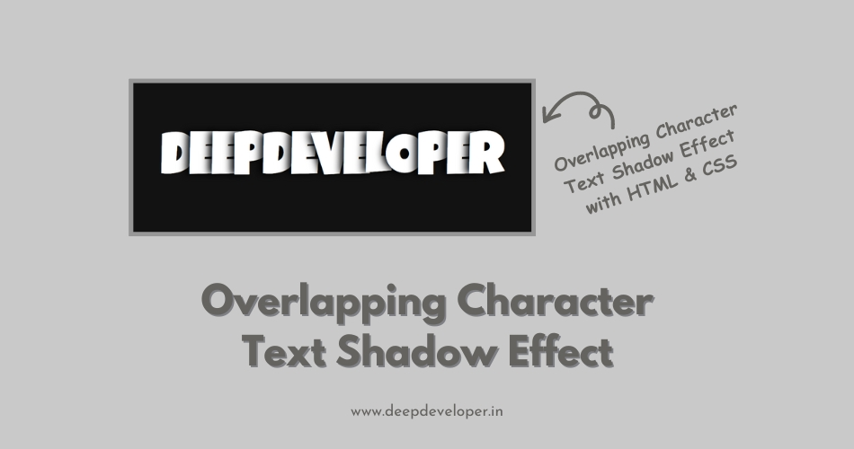
Creating eye-catching and visual appealing text effects can significantly enhance the design of a website. Overlapping characters text shadow is one of the such effects that can add depth in the text to make it look interesting. This effect gives the impression of letters stacking upon each other. In this blog, we are going to create a overlapping characters text shadow with HTML, CSS & a simple touch of JavaScript.
The concept behind overlapping characters text shadow is very simple. When we create a traditional text shadow we follows the outline of the characters. Overlapping characters text shadow involves duplicating the text multiple times and offsetting each duplicate slightly from the original. By adjusting the position and opacity of these duplicates, we create the illusion of overlapping characters, adding depth and dimension to the text.
HTML Structure:
Create a html file with name index.html and write text in h1 heading tag in <body> tag as I have written “DEEPDEVELOPER”. Give two class to this h1 tag named overlap and overlap-front.
<!DOCTYPE html>
<html lang="en">
<head>
    <meta charset="UTF-8">
    <meta name="viewport" content="width=device-width, initial-scale=1.0">
    <title>Document</title>
</head>
<body>
    <h1 class="overlap overlap-front">Deep Developer</h1>
</body>
</html>
Styling with CSS:
Now create a CSS file with name style.css and link this file to your index.html file with the help of <link> tag. First of all, import google fonts (as shown below). Here I am using google font “Luckiest Guy” to create a overlapping character shadow effect.
@import url('https://fonts.googleapis.com/css2?family=Luckiest+Guy&display=swap');

html {
  color-scheme: dark;
}
h1 {
  text-align: center;
  font-size: 20vmin;
  font-family: 'Luckiest Guy', cursive;
  text-transform: uppercase;
}
.overlap{
  --overlap: .15ch;
  --shadow-offset: .1ch;
  --shadow-blur: .2ch;
  --shadow-color: black;
  letter-spacing: calc(var(--overlap) * -1);
  isolation: isolate;
}
.overlap-front { --mult: 1; }
.overlap-back { --mult: -1; }

.overlap>span {
  position: relative;
  z-index: calc(var(--index, 1) * var(--mult, 1));
}
.overlap-front>span:not(:first-of-type),
.overlap-back>span:not(:last-of-type){
  text-shadow:
    calc(var(--mult, 1) * var(--shadow-offset,0) * -1) 0
    var(--shadow-blur, 0)
    var(--shadow-color, black);
}
JavaScript: .
Now, Create a JavaScript file with name script.js and link this file to your index.html file with the help of <script> tag. Here you can read about, how to link a JavaScript File to HTML file.
const overlapEls = document.querySelectorAll(".overlap") || [];
overlapEls.forEach(el => {
  const chars = [...el.textContent];
  el.innerHTML = "";
  chars.forEach((char,index) => {
    const span = document.createElement("span");
    span.textContent = char;
    span.style.setProperty("--index", index)
    el.append(span)
  })
})
Output:

Also Read: Text Shadow Effect Using HTML and CSS
Final Word:
In this blog or you can say tutorial, we’ve created overlapping characters text shadow using HTML, CSS and JavaScript. By leveraging CSS pseudo-elements and positioning techniques, we achieved a characters text shadow effect that adds depth and dimension to text elements. We can use such type of text effects for headings, banners, or other design elements. Now you are free to experiment with different fonts, colors, and animations to customize the effect and make it your own. Happy coding!